top of page

The first step was the creation of a logo. Our task was to show strength and fragility, to show the desire to go through this path of changes with UPgrade!
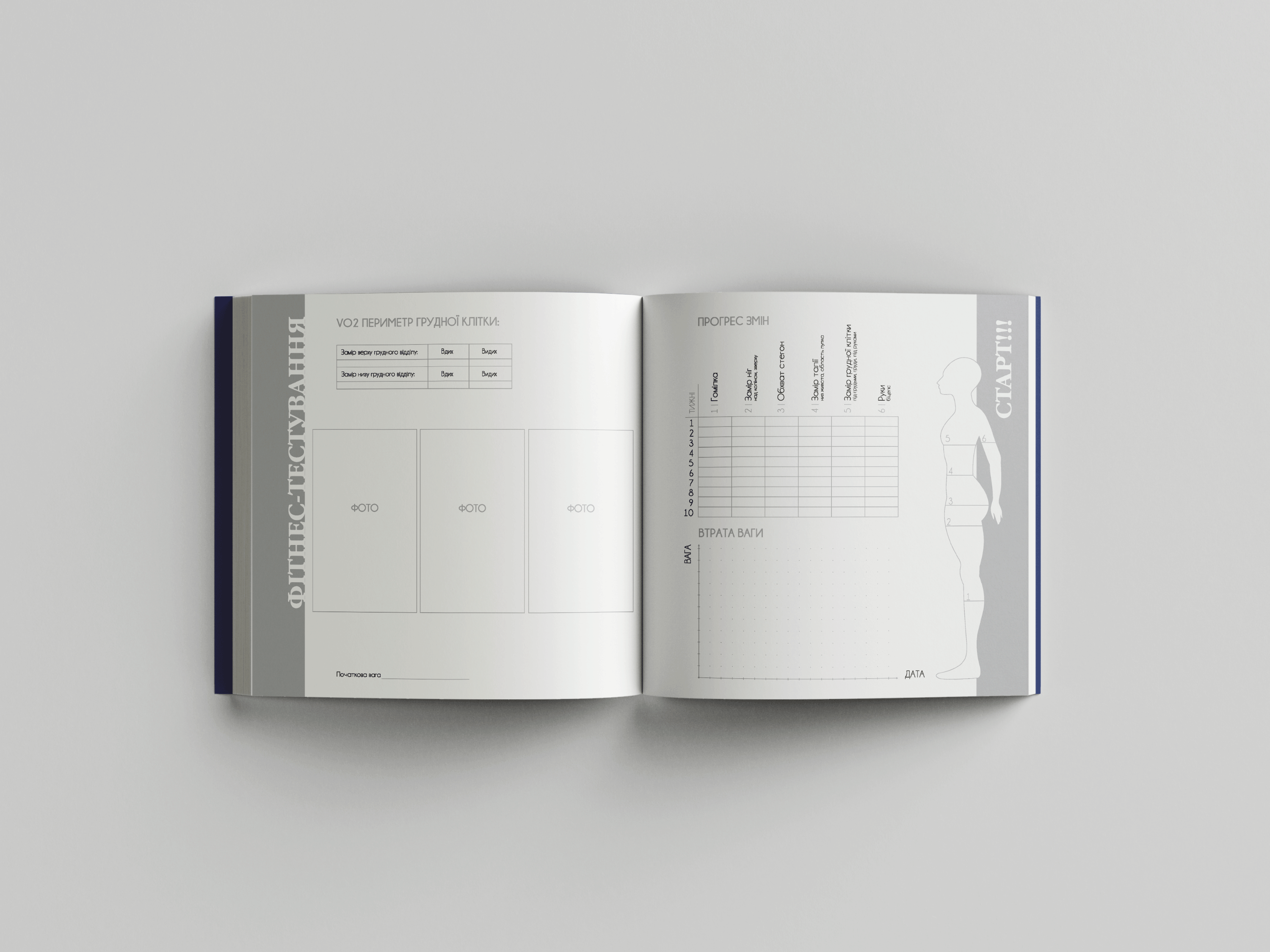
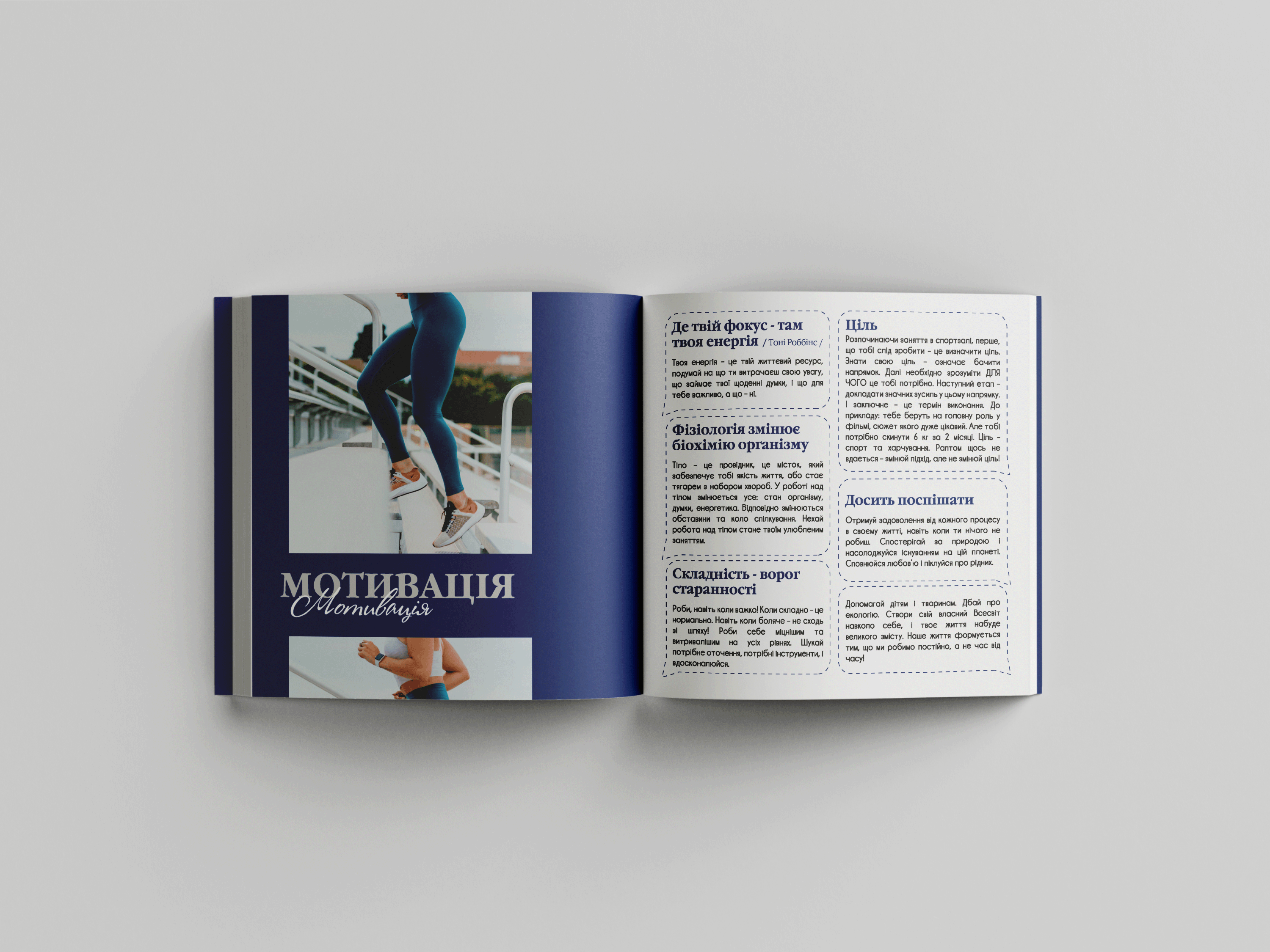
The logo combines two fonts that reflect the essence of UPgrade's mission! The next step is the development of the design and layout of the diary. The grid is convenient for filling in goals and achievements, with useful inserts about nutrition and sports. The result of our cooperation with UPgrade was a unique, carefully selected fitness book, created with all the details we had inmind.
CLIENT:
Upgrade
SERVICES:
Logotype
Catalogue layout
Printing


bottom of page